

El mundo laboral cambió.
Pero la forma en que tomamos decisiones dentro de él… no tanto.
Candidatos buscando oportunidades sin claridad.
Reclutadores evaluando perfiles con información incompleta.
Procesos largos, resultados inciertos y, muchas veces, decisiones que podrían haber sido mejores.
StephAi nace en ese punto de fricción para hacer las cosas de forma diferente, usando inteligencia artificial pero sin perder la calidez humana y la capacidad de decidir.
Un espacio para tomar mejores decisiones
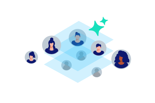
Este blog está pensado tanto para quienes buscan trabajo como para quienes buscan talento.
Porque, aunque estén en lados distintos del proceso, comparten un desafío común:
tomar decisiones más informadas, más estratégicas y con mejores resultados.
¿Qué vas a encontrar aquí?
Contenido práctico, directo y aplicable, enfocado en mejorar la calidad del proceso completo:
-
Cómo destacar (de verdad) en un proceso de selección
- Evitar que tu CV siga siendo descartado por sistemas automatizados
-
Cómo evaluar candidatos más allá del CV
-
Uso inteligente de herramientas digitales e inteligencia artificial
-
Optimización de procesos sin perder el criterio humano
-
Reflexiones sobre sesgos, expectativas y decisiones laborales
Más que herramientas, criterio
Hoy existen cientos de plataformas, automatizaciones y metodologías.
Pero ninguna reemplaza algo clave:
la capacidad de entender, analizar y decidir bien.
StephAi no busca solo acelerar procesos,
sino ayudarte a elevar el nivel de tus decisiones, estés del lado que estés.
Este es el comienzo
Si llegaste aquí, probablemente estás buscando hacer las cosas mejor.
Y eso ya te pone un paso adelante.
Este blog va a crecer contigo:
cuestionando, guiando y aportando claridad en un proceso que muchas veces se siente más complejo de lo que debería.
— StephAI Team ✨